

Before we talk about the importance of color contrast for web accessibility, it’s important to define what color contrast is.
Color contrast is the difference in lightness between the foreground color, like text, and the background color. If the foreground color’s values are too similar to the background, the elements can blend together with the background. For example, light gray on a white background has a low contrast, while black text on a white background has a high contrast. Light Gray text will blend into the background while black text will stand out.
Why is Color Contrast important for Web Accessibility?
A high color contrast improves benefits a wide range of users such as users with low vision, color blindness, and those viewing screens in poor lighting or with glare.
- Low Vision: It ensures text is distinguishable from the background for users with low vision.
- Color Blindness Support: High contrast, provides separation between elements that users with color vision deficiency might otherwise confuse.
- Prevents Eye Strain: Clear contrast reduces fatigue, making reading easier and more comfortable for all users.
- Handles Adverse Conditions: It helps ensure that the content is readable even with device glare, bright sunlight.
- Meets Legal Standards: Adhering to the WCAG (Web Content Accessibility Guidelines) contrast ratios helps ensure your website is compliant with accessibility requirements.
The WCAG Contrast Standards
The Web Content Accessibility Guidelines (WCAG) are the international standard for web accessibility. They provide specific, quantifiable contrast ratios that websites must meet.
Key Contrast Ratios:
- AA Level (Minimum Requirement):
- Normal Text: A contrast ratio of 4.5:1.
- Large Text (18pt or 14pt bold): A contrast ratio of 3:1.
- User Interface Components & Graphics: A contrast ratio of 3:1 (e.g., icons, input borders, graphs).
- AAA Level (Enhanced Requirement):
- Normal Text: A contrast ratio of 7:1.
- Large Text: A contrast ratio of 4.5:1.
The 4.5:1 ratio for normal text (Level AA) is the industry benchmark and the target every website should strive for as a minimum.
How to Test Contrast
There are many free sources to test color contrasts. One of those free sources is WebAIM’s Contrast Checker. Designers and developers can enter the foreground and background color to check if the contrast is WCAG AA or AAA compliant.
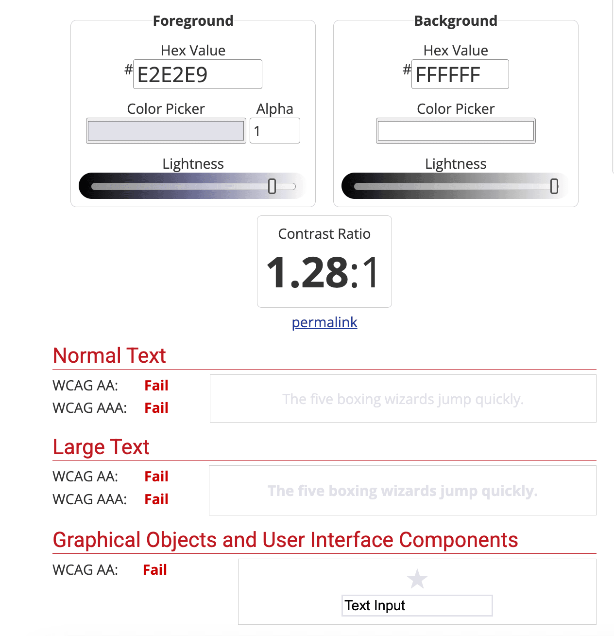
Example of a bad color contrast
The screenshot below shows a foreground color of E2E2E9, which is light gray and background color of FFFFFF, which is white. The foreground and background color have a contrast ratio of 1.28:1, which does not pass WCAG AA or AAA standards.
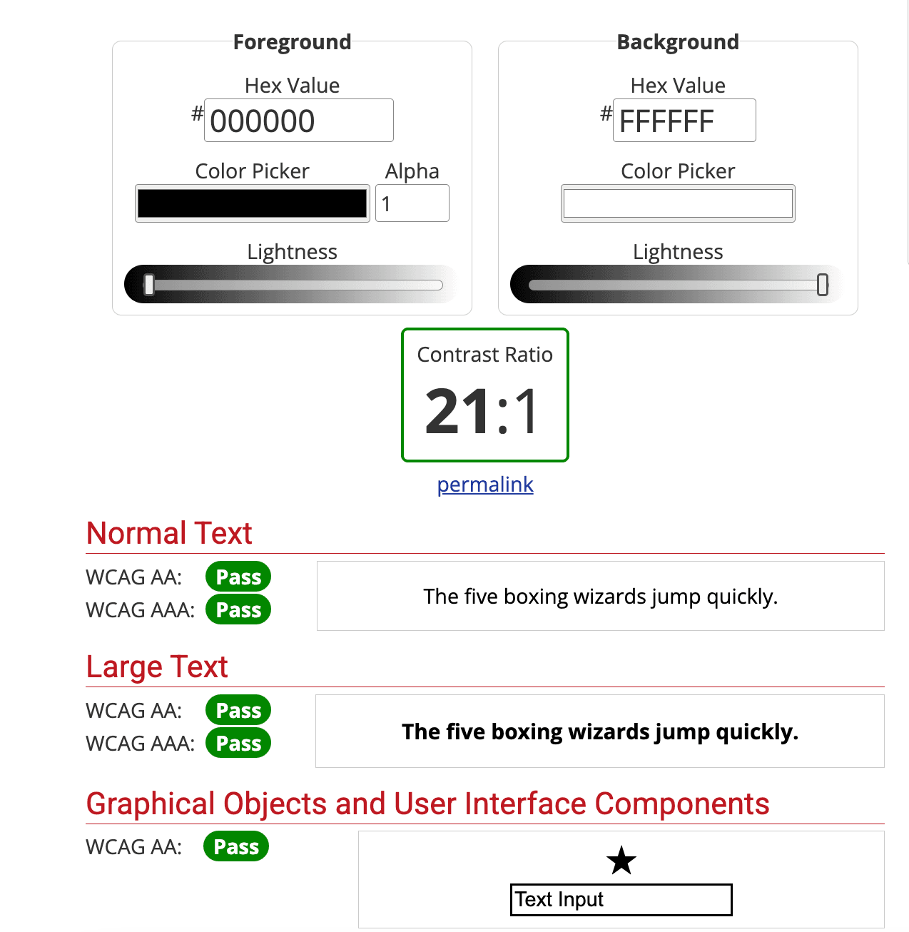
Example of a good color contrast
The screenshot below shows a foreground color of 000000, which is black and background color of FFFFFF, which is white. The foreground and background color have a contrast ratio of 21:1, which passes WCAG AA or AAA standards.
Conclusion
In conclusion, prioritizing color contrast empowers a wide range of users such as users with low vision, color blindness, and those viewing screens in poor lighting or with glare. Prioritizing color contrast is not just about compliance with accessibility guidelines; it fosters an inclusive digital environment.